My personal COVID-19 experience: a data project

Covid knocked me out quite good. I contracted the virus right at the start of summer and spent more than a week in bed – with aching limbs, a sore throat and body temperature almost reaching 40°C. Immediately after the first positive antigen test I decided to monitor my body more closely and generate some data to play with later.
This post summarizes what I have learned through making a data project out of my Covid infection. It features accessing Garmin fitness data via GarminDB, manipulating timeseries with Pandas and a simple correlation analysis (heart rate vs. body temperature), rediscovering a physiological phenomenon that was news to me.
Data recording (body temperature + heart rate)
Even before developing severe symptoms, I decided to constantly wear my Garmin fitness watch and to take my temperature at least once per hour. My Garmin vívoactive 3 does an okay job at measuring heart rates. Although sort of noisy, it works well for long-term monitoring. I measured the body temperature twice (under the tongue) and noted both values in a Google Sheet. The data collection part of this project emphasized an important caveat:
Manual data entry is challenging.
It is time consuming and you cannot really trust the resulting data — even if you are doing it yourself. When reviewing the data for my exploratory analysis, I had to clean up several issues, such as wrong dates and falsely placed decimal points.
Exploration of temperature data
We can take a quick look at the raw temperature data. First, reading the data from a (already cleaned) CSV file:
|
|
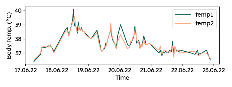
Now, we can plot the two manual measurements over time.
|
|

Although it did not feel like it at the time, there is a solid agreement
between the two columns (R² = 0.91). For later analyses, both values
are averaged into a single "temp" column:
|
|
Accessing fitness data from Garmin Connect
Garmin stores the entire fitness data (activities, heart rates, sleeping, etc.) you generate in the cloud. It can be accessed via app or web interface with the user’s Garmin Connect account. The apps are great for visualization of the data, but they are not made for more elaborate analyses. Luckily, Garmin also provides an API to retrieve all the raw data – a dream scenario for a data scientist.
GarminDB
The open-source GarminDB package provides a couple of nice tools to retrieve and preprocess data from Garmin Connect. With its straight-forward command line interface, it takes little effort to get the data into SQLite database files on your local machine.
Installing GarminDB works seamlessly through pip.
pip install garmindb
Next, for some user-specific settings, the
example GarminConnectConfig.json
from the repository to ~/GarminDb. Importantly, user credentials can be added
here, as well as the start date from which data should be loaded.
|
|
With the configuration done, data can be exported from Garmin Connect in one command. It does a bit more than we actually need for this project, but I like to have the complete database locally.
|
|
The command takes quite a long time. Once it is done, the downloaded data is
available in various SQLite databases and JSON files under ~/HealthData/.
Sometimes when running the above command, I got an error saying “Failed to login!”. The error disappeared for me after a couple of repeated calls.
Also, on Windows, the command above did not work due to a file association
problem. It actually opened the Python file in the editor, rather than
executing the script. Not wanting to set file associations to the python.exe
inside my virtual environment, I used a small workaround to get it running.
Inside the virutalenv, where GarminDB was installed, you can call
python %VIRTUAL_ENV%/Scripts/garmindb_cli.py.
The monitoring database
While there are a couple of other databases, the main focus for me was
the monitoring database. Among other things, it provides the heart rate
recorded every minute.
We can explore the database using the SQLite command line program (install
on Windows for example with
Chocolatey).
The .tables command lists all tables. .schema <tablename> provides the
list of columns and corresponding datatypes.

We can load the table into Pandas using pd.read_sql and
sqlite3. sqlite3 is part of the Python
standard library, so no additional pip install needed.
|
|
Data wrangling
While recording both body temperature and heart rate, I noticed that my heart was beating faster, when the thermometer read higher values. Therefore, I want to analyze the correlation between my pulse rate and body temperature. In order to do this, both variables need to be aligned in time. In addition, temperatures are recorded at non-uniform intervals of roughly 50-60 minutes, whereas the heart rate is given every minute. Some data wrangling is required.
First, we drop heart rate data outside the time range of recorded temperatures.
For shorter code later, we also rename the heart_rate column to hr.
|
|
As the heart rate signal is quite noisy, I am also creating a smoothed version
for visualizations. There are several options for smoothing. Here, I am using
a moving average with Pandas' rolling method.
Pandas works great with datetime indices. We can easily specify a centered
moving window of 30 minutes, not worrying about sampling rate or non-uniform
intervals. For a valid computation, we require at least
15 samples captured by the window (this is an arbitrary choice, it does not
really matter for the correlation analysis).
|
|
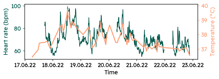
Now, the two timeseries can be plotted to get a first feel of the correlation. There are some gaps in the heart rate data, where I had to take off the watch to recharge the battery.
|
|

It appears that the two signals are are not independent of each other. But in order to quantify that relationship, further preprocessing is needed.
Again, Pandas makes it very easy, to combine heart rates and temperatures for analysis. We need to resample both signals to common time intervals. During each interval, we get the mean and standard deviation of both signals. The standard deviation is a good indicator of the noise level in the heart rate data. As this resampling produces some empty rows, we remove them immediately.
|
|
mean and std)
for each column. The last line above flattens the index and creates
single-level column names like temp_mean and hr_std.Correlation analysis: temperature vs. heart rate
At last, we can quantify the correlation between my body temperature and heart
rate throughout the Covid infection.
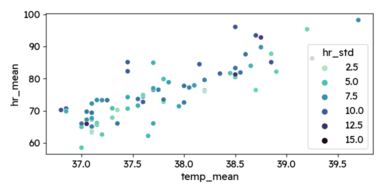
First, let’s plot the two parameters against each other.
Coloring by hr_std we can additionally see, how signal noise affects the
correlation.
|
|

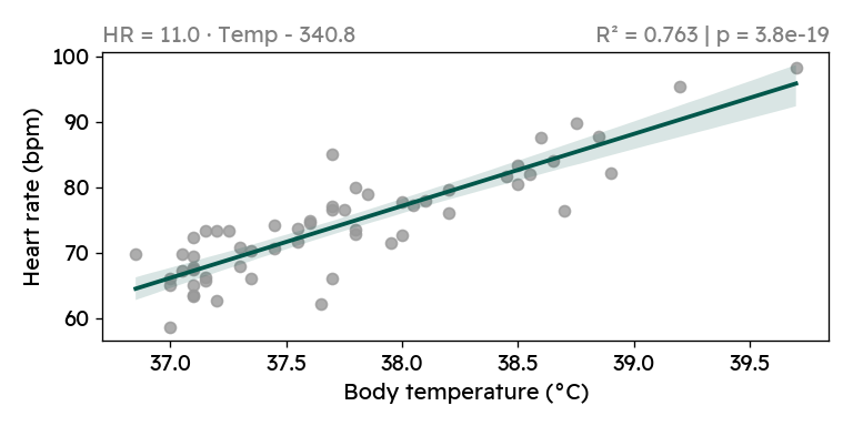
Especially towards the edges, we see data points with higher standard deviation in the heart rate signal. It therefore makes sense to clean up a bit and remove the most unreliable points. I am dropping the highest standard deviations (top 15%, >9.34 bpm) and calculate the regression metrics for the original and cleaned dataset.
|
|
We see that the correlation between heart rate and body temperature is highly significant, both when including and when excluding the heart rate outliers. For every degree of increased body temperature, my heart rate increases by 11 beats per minute. While looking at the plot above, I of course also googled this phenomenon. It is well documented, that a higher body temperature causes increased heart rate — although the reported relationship suggest a smaller increase of (7-10 bpm/°C) 123.
We can also compute a confidence interval for my personal regression slope using
statsmodels.
For the cleaned data, the 95% confidence interval for the slope is
[9.356, 12.638], still rather high compared to the literature.
|
|
                            OLS Regression Results
==============================================================================
Dep. Variable:                hr_mean   R-squared:                       0.763
Model:                            OLS   Adj. R-squared:                  0.759
Method:                 Least Squares   F-statistic:                     180.2
Date:                Sun, 07 Aug 2022   Prob (F-statistic):           3.80e-19
Time:                        17:34:59   Log-Likelihood:                -162.28
No. Observations:                  58   AIC:                             328.6
Df Residuals:                      56   BIC:                             332.7
Df Model:                           1
Covariance Type:            nonrobust
==============================================================================
                 coef    std err          t      P>|t|      [0.025      0.975]
------------------------------------------------------------------------------
Intercept   -340.7683     30.917    -11.022      0.000    -402.703    -278.834
temp_mean     10.9972      0.819     13.424      0.000       9.356      12.638
==============================================================================
Omnibus:                        2.450   Durbin-Watson:                   1.653
Prob(Omnibus):                  0.294   Jarque-Bera (JB):                1.594
Skew:                          -0.276   Prob(JB):                        0.451
Kurtosis:                       3.596   Cond. No.                     2.20e+03
==============================================================================
Finally, I want to create a nice plot, which I would include in report.

|
|
Conclusion
Going through Covid wasn’t so fun. But exploring my health data from that experience was very rewarding. I saw first hand, how difficult it can be to get trustworthy and accurate data. And I learned how to access and play with my Garmin health data.
Data wrangling with timeseries of different formats and frequencies can be quite challenging. However, the Python ecosystem (most notably Pandas) provides many great tools for dealing with such data and makes it at times ridiculously easy to perform certain tasks.
The data analysis revealed a strong correlation between body temperature and heart rate. Although this is already a well-documented phenomenon, it was still news to me. And through some simple statistics and modeling (R², linear regression), we found that with increasing body temperature, my heart rate grew faster than described in the literature.
Finally, I want to note that I feel lucky, that I did not experience any major complications with my Covid infection. Many have to go through worse and my heart is with anyone experiencing severe medical conditions.
Stay healthy and stay safe!
Below is the complete Python code from this post. You can download the code
with data from here.
|
|
(References)
-
J. Karjalainen and M. Viitasalo, “Fever and cardiac rhythm,” Archives of internal medicine, vol. 146, no. 6, pp. 1169–1171, 1986, doi:10.1001/archinte.1986.00360180179026. ↩︎
-
G.W. Kirschen, D.D. Singer, H.C. Thode and A.J. Singer, “Relationship between body temperature and heart rate in adults and children: A local and national study,” The American journal of emergency medicine, vol. 38, no. 5, pp. 929–933, 2020, doi:10.1016/J.AJEM.2019.158355. ↩︎
-
M.E. Broman, J.L. Vincent, C. Ronco, F. Hansson and M. Bell, “The Relationship Between Heart Rate and Body Temperature in Critically Ill Patients,” Critical care medicine, vol. 49, no. 3, pp. E327–E331, 2021, doi:10.1097/CCM.0000000000004807. ↩︎